 LINGCORE SCI
Data Visualization in Medical Research: Communicating Complexity with Clarity

In high-impact medical journals, a figure is often the first element an editor or reviewer evaluates. Effective data visualization is not merely an aesthetic choice; it is a critical instrument for scientific communication. As datasets grow in complexity—from longitudinal clinical cohorts to multi-omic profiles—the ability to distill high-dimensional information into clear, high-resolution figures has become a baseline requirement for publication success in 2026.
Core Insight: Clarity must precede decoration. A high-impact figure should be self-explanatory, allowing the reader to understand the primary finding within 30 seconds without frequent cross-referencing to the main text.
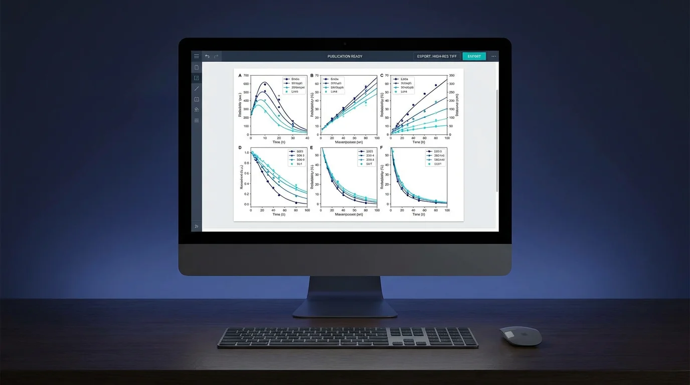
Principles of High-Resolution Scientific Design
Designing for clarity requires a disciplined approach to the visual presentation of data. Researchers must balance information density with readability, ensuring that the visual hierarchy guides the reader toward the most important evidence.

- Maximize the Data-to-Ink Ratio: Remove non-essential elements such as gridlines, 3D effects, and excessive bordering. Every pixel should serve the objective of conveying information.
- Color Utility and Accessibility: Use color to encode meaningful variables, not for decoration. Ensure palettes are color-blind accessible and maintain high contrast when printed in grayscale.
- Annotation Precision: Ensure all axes are clearly labeled with units, and legends are placed to minimize ocular travel. Use direct labeling on curves where possible to avoid repetitive legend scanning.
Choosing the Appropriate Chart Type
The selection of a visualization format is governed by the nature of the data and the specific research question. While traditional bar charts remain common, more sophisticated visualizations often provide a more transparent view of the underlying data distribution.
For example, violin plots or box plots with overlaid jittered points are superior to simple bar charts for showing data dispersion and potential outliers. In clinical trials, Kaplan-Meier curves and Forest plots must adhere to strict reporting standards to ensure that hazard ratios and confidence intervals are accurately represented.
The Lingcore SCI Visualization Workflow
At Lingcore SCI, we facilitate the creation of publication-ready figures through our Writing Co-pilot and Paper Analyzer tools. We help researchers verify that their data visualizations meet the technical specifications of top-tier journals, including DPI requirements, color space standards, and font size legibility.
Conclusion
A well-designed figure is a hallmark of professional research. By prioritizing clarity, accessibility, and methodological rigor in your data visualizations, you not only improve the immediate impact of your manuscript but also contribute to the overall scientific integrity of the medical literature.